In the beginning of the project Methods of Contextualising: Publishing and Literacy, our group (Marilyn, Yini, Moye and myself) individually explored how graphic communication design can function as a flexible tool to make complex student travel statistics more accessible.
I began my exploration by examining how people understand climate change and how graphic communication design shapes that understanding.
While reviewing the dataset, I encountered transport emission records from 2015–2020. Looking at these records, I started to think about carbon emissions not as isolated events but as accumulations over time. The travel spreadsheet began to resemble the gradual build-up of CO₂ within geological sediments.
According to Parsons D.’s public lecture “The Plastocene – Plastic in the Sedimentary Record,” human-made materials can become preserved within sedimentary layers and even function as markers for dating historical periods, ranging from glass bottles to debris from World War II. This perspective encouraged me to rethink data visualisation. Emissions no longer appeared as abstract statistics but as material traces with temporal duration.
To visualise this accumulation, I decided to gather transport emission data representing how students move within the UK. My aim was to help the audience understand not only the emissions themselves, but also how they gradually accumulate over time.
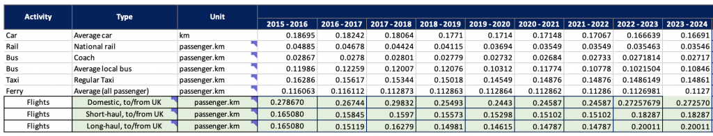
Using this data, I began to translate the information into geological sediments. Inspired by metamorphic charts, I visualised the 2015–2016 transport emissions using different rock particle structures. Transport modes with higher emissions were represented with larger rock particles and darker tonal values, while lower-emission transport was illustrated with smaller particles.
I deliberately worked in black and white using pencil and charcoal. This material choice allows the drawings to be read as references to fossil fuel histories.
For example, flights, the heaviest and most emission-intensive layer, are represented as anthracite with large rock particles. Ferries appear as medium-sized particles inspired by gneiss, whose pattern also subtly resembles water waves. Meanwhile, coach and rail transport are visualised using much finer particle textures to reflect their comparatively lower emissions.
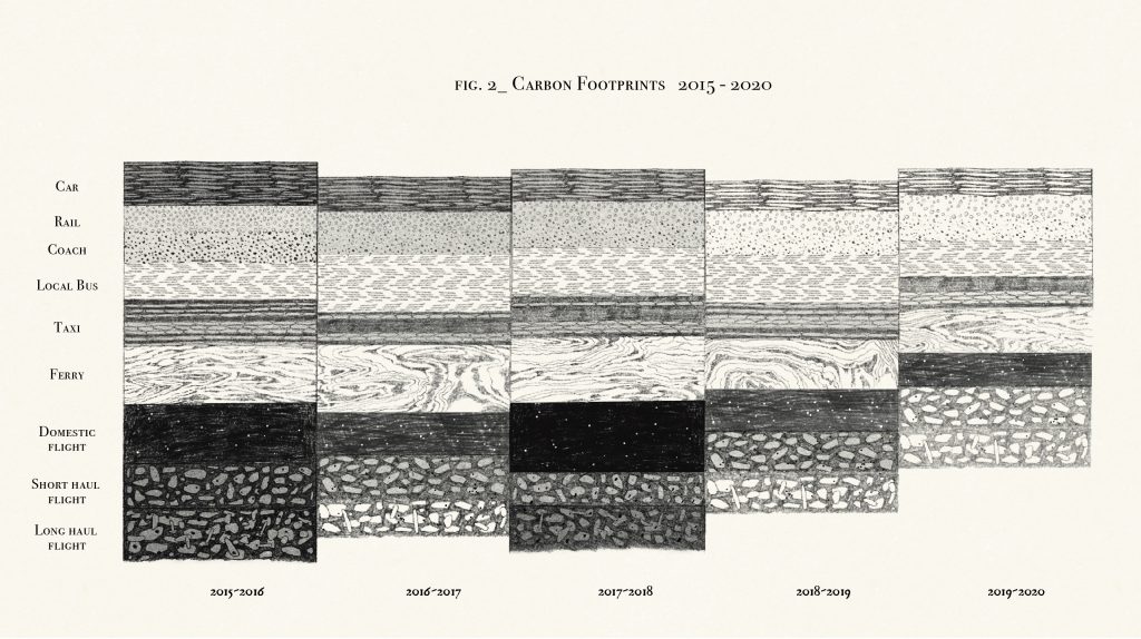
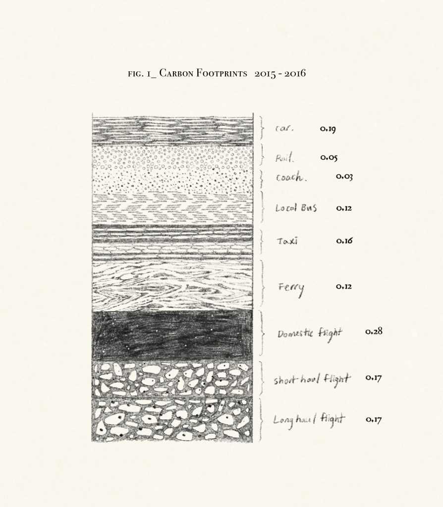
I continued this process for each year of data. Initially, I arranged the layers in a landscape format, but the sense of accumulation was not very visible. To emphasise the build-up over time, I began stacking the layers vertically in a long portrait format.
I then applied this method to analyse the flight data of UAL students from 2024–2025. I recalculated the dataset to focus only on air travel records based on students’ countries of departure.
This time, I decided to introduce colour. While the earlier drawings used charcoal to evoke fossil fuel histories, the addition of colour allows the sediments to be read as a cross-section of an ongoing energy system, something still active in the present.
The colour scale follows a simple rule:
- Lowest emission layers are represented in pale yellow, suggesting low-energy deposition.
- Medium emission layers shift into orange and red, indicating increasing energy intensity.
- The highest emission layers appear in purple, marking high-energy depositional events.
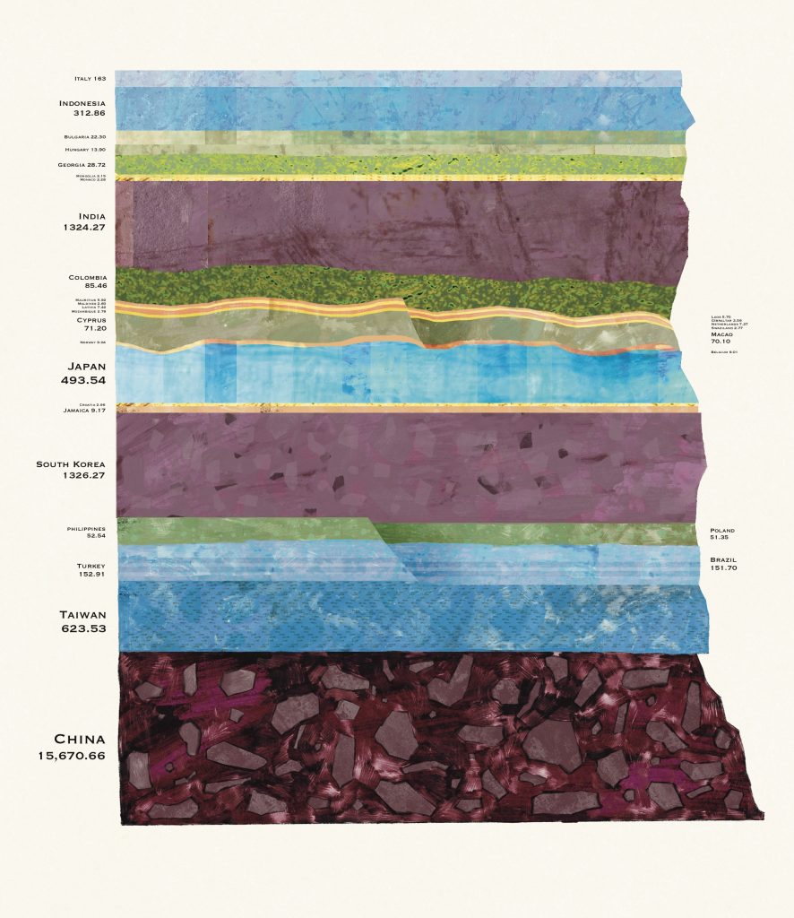
In this work, I treat carbon emissions as energetic depositional events. The colour scale is derived from geophysical seismic amplitude mapping and thermal heatmaps, where colour represents energy intensity rather than material type.
Traditionally, geological strata record the accumulation of physical materials. However, within the context of the Anthropocene, these layers can also be understood as records of human actions. In this sense, the work does not simply depict soil or rock; it visualises how the repeated act of choosing to fly may accumulate into a future geological record.
However, while developing these visualisations, I began to question the implications of representing student mobility through carbon emission data.
Studying abroad is not inherently wrong, and students should not be blamed for travelling to pursue education. This led me to ask: if I visualise this data, who is the audience, and who is being held responsible?
International student mobility is not simply an individual ethical choice, but rather a structural condition produced by the global education system. In this sense, the dataset does not represent individual behavioural data, but something closer to institutional dependency data. The internationalisation of universities relies on physical mobility. This raises an important question: does the responsibility for carbon emissions lie with the individual, or with the system that requires this movement?
I began to worry that visualising travel emissions could unintentionally frame the issue as a matter of personal guilt. Instead, I wanted to shift the focus towards the institutional structures that make this mobility necessary.
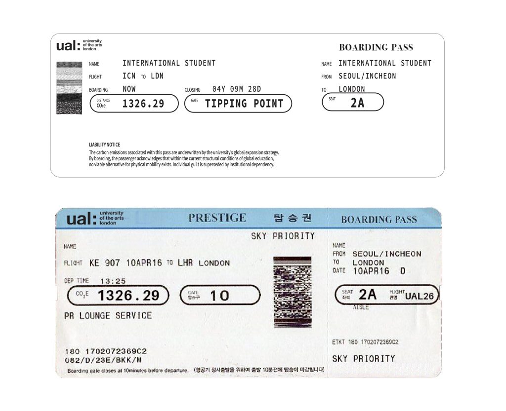
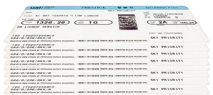
To explore this idea, I started working with the visual language of an airplane ticket. Traditionally, a flight ticket functions as a record of movement. In this project, however, the ticket is reframed as an access permit. The student has not simply chosen to travel; mobility becomes a requirement for accessing education.
Using UAL student travel data, I organised countries based on their flight distance to London and calculated the associated carbon emissions. Countries were ranked from 1 to 131 according to their emission levels. The ticket structure assigns mobility bands: Row A for long-haul flights, Row B for short-haul flights, and Row C for domestic flights.
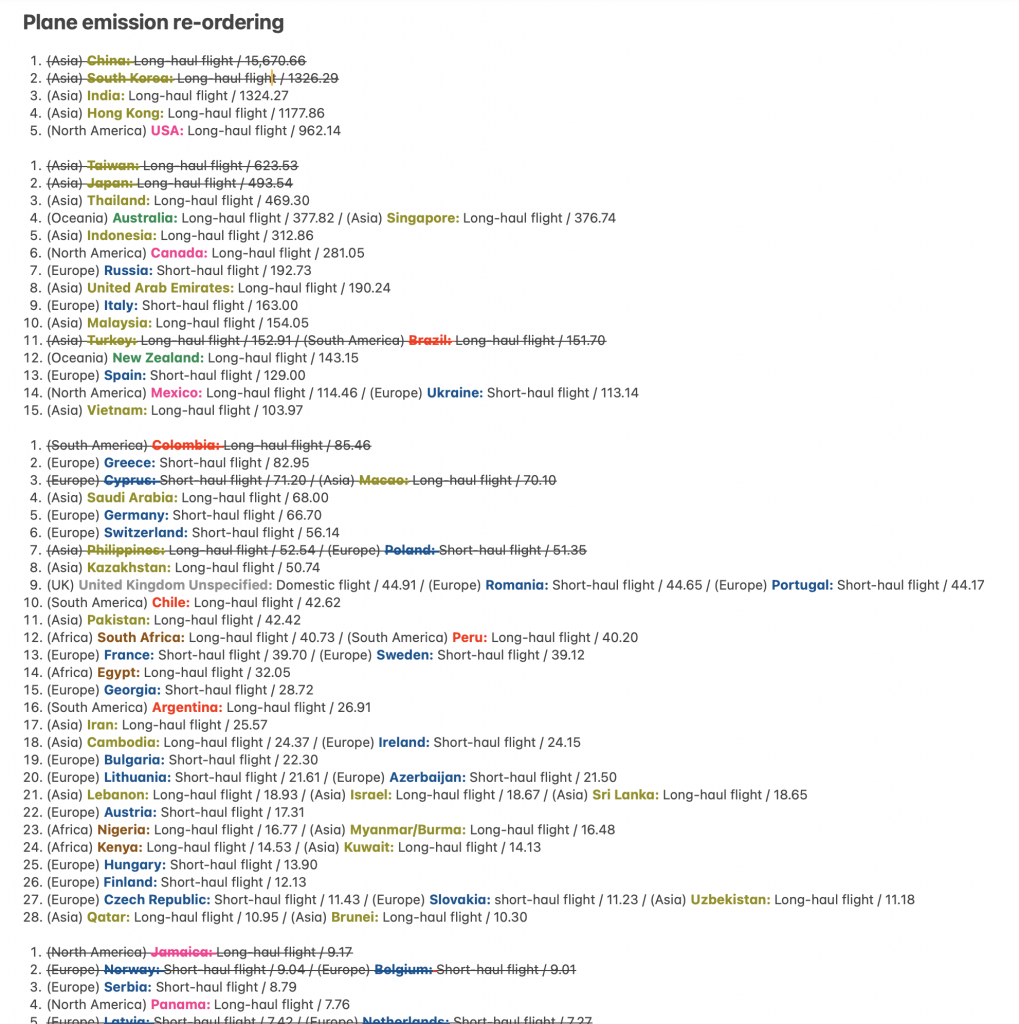
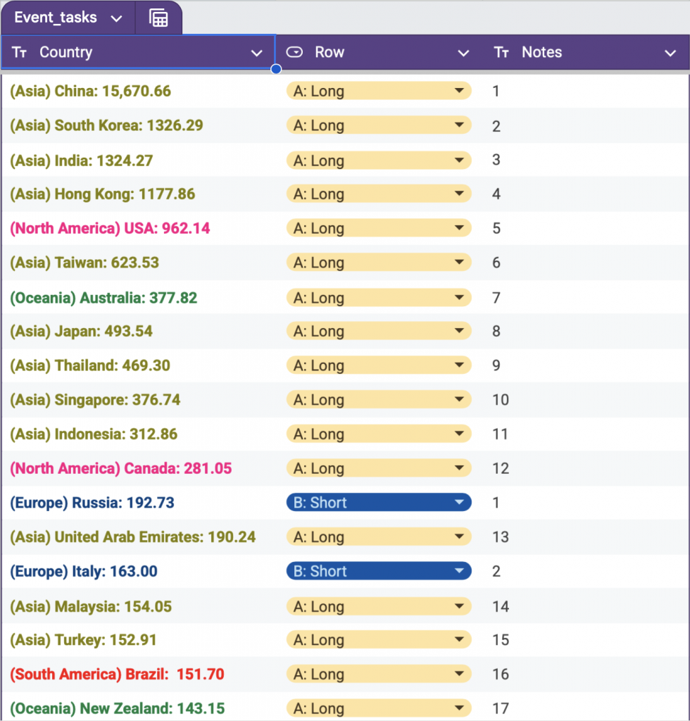
The ticket is issued by UAL, and the distance and travel time are translated into calculated CO₂ emissions. Even the seat number becomes a ranking of carbon emission, transforming the familiar format of a boarding pass into a record of authorised movement within the global education system.
I also tried stacking the 131 tickets to show how these carbon emission accumulates on to the geological sediments.
Leave a Reply