Last week’s tutorial, there were three main concerns/ideas raised:
- Problem 1: The Necessity of a Physical Object: A project about “unfolding” couldn’t just remain a flat digital layout or a basic booklet. I needed a physical mechanism where the form itself reflected the tension between state control and personal memory.
- Problem 2: Information Overflow: For instance, in the “Comfort Women” archive, there were too many heavy stories—the denial of a Catholic funeral, the embezzlement of funds, the abandonment of relics. Trying to show everything especially to foreign audience kind of made the narrative feel overwhelming.
- Problem 3: The Divided Audience: Who is this archive for? The background knowledge and emotional baggage of a Korean audience and an international audience are completely different. Korean viewers often feel fatigued by overexposed historical narratives, while international viewers lack the basic historical context entirely.
solution to problem 1&3:
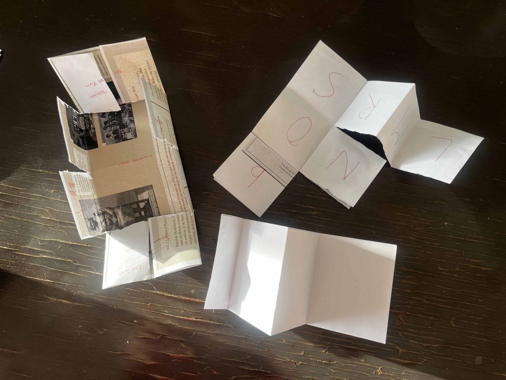
I initially tried different types of according forldings and see what would be the best.
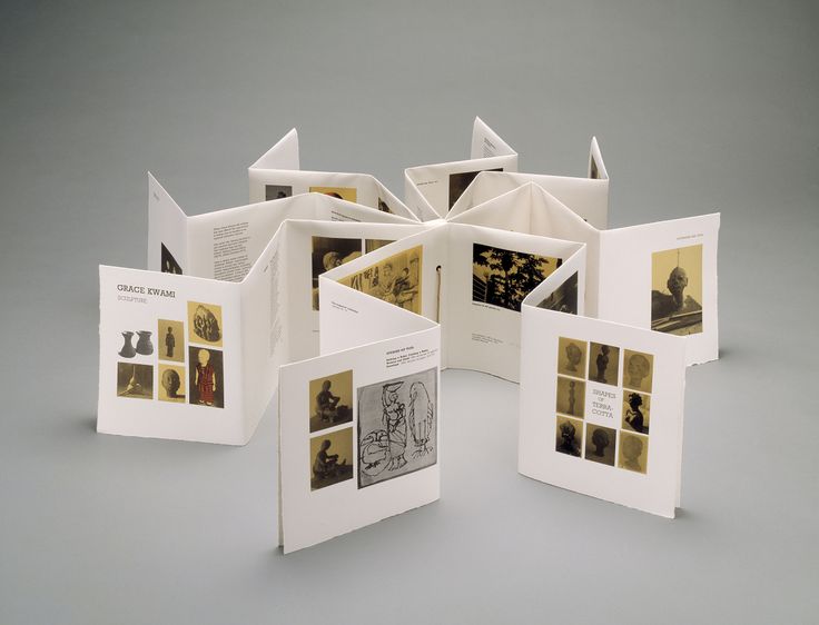
but then, i found this project by Atta Kwami’s ‘Grace Kwami Sculpture’, a leporello bound book designed to unfold and stand on its edge. and I thought maybe I can I adapted this into a “Pocket-Accordion” structure.
I started some sketches. I adapted this into my own structure.
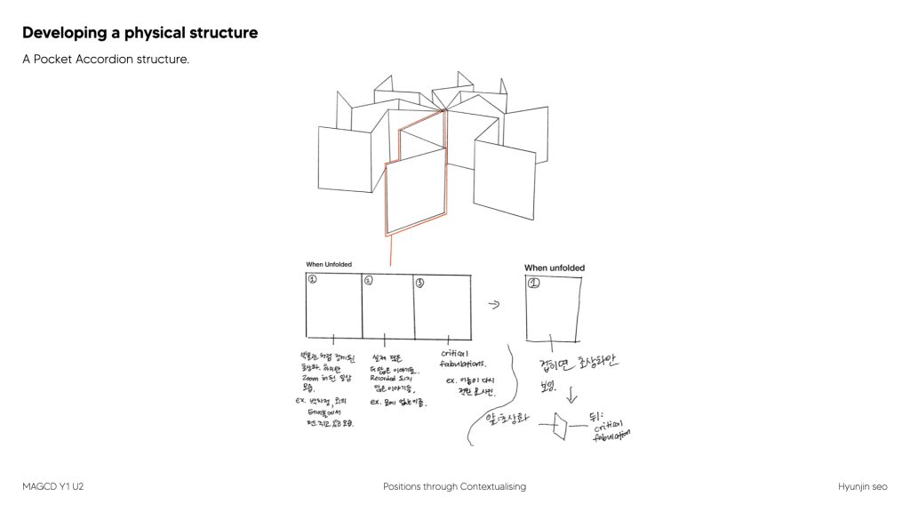
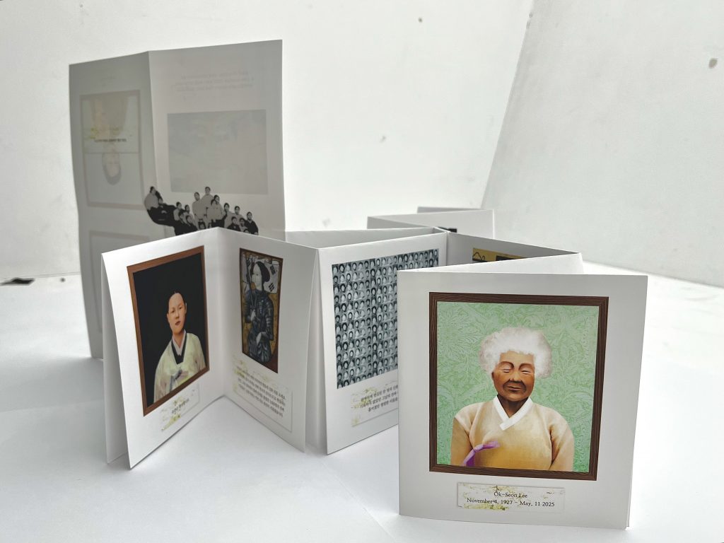
An A3 sheet, folded into a pocket, with specific creases cut so that the book can only be fully read from one direction at a time. When closed, it feels cold and rigid, like a museum specimen box. But when unfolded, three layers of truth emerge. The single sheet of paper represents the oneness of the archive, but the folds create multiplicity. it kinda responds to my enquiry as the paper resists being opened, just as the institution resists being questioned.
- Layer 1: The official surface. State-approved portraits and formal captions. Authoritative. Complete.
- Layer 2: The distorted archive. The same people, but now the cracks begin to show. What the institution silenced.
- Layer 3: Critical Fabulation. Based on Saidiya Hartman’s idea of filling the gaps with imagination, but never hiding that it is imagination. A restorative space created by the designer, not a discovered fact.
Critical Positionality of the Structure
This physical limitation became a conceptual strength. The book can only be read from one direction at a time.
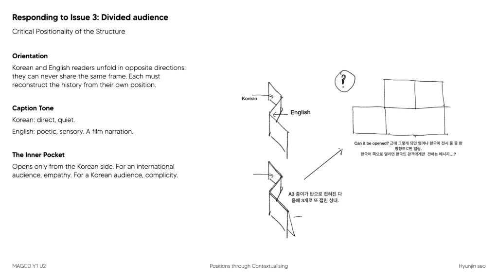
Korean and English readers unfold the book in opposite directions. They can never share the same frame. Each must reconstruct the history from their own position.
And the captions are different too, not just in language, but in role. Korean captions speak directly, quietly, like someone whispering something you already knew but chose to forget. English captions are like a film narration.
At this point, I decided the inner pocket opens only from the Korean side. Because the weight of responsibility is different. For an international audience, this is a universal human rights issue, empathy. But for a Korean audience, we are the accomplices. We allowed this state violence to be silenced. The inner pocket contains what cannot be translated, a private space that resists the institution’s power.
Solution to Problem 2:
Last week’s feedback raised the issue of information overflow. Too many heavy stories at once. I spoke with the curation team at the museum about this.
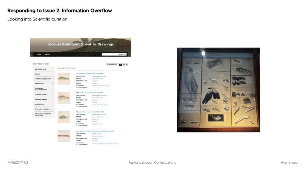
Scientific curation aims for classification and preservation, erasing the curator’s voice to appear objective. Like Louis Agassiz’s fish catalogue. but Art curation, as Rachel says, is about looking after, keeping the context alive.
Then I looked at Shaun Tan’s The Arrival.
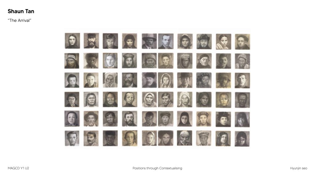
It starts with portraits of immigrants at the very start of the book and then open up the story of Four or five different immigrant stories. No words at all. And yet it never feels overwhelming. Because Shaun Tan doesn’t give information. He gives sensation. You don’t need the historical context to feel the human soul.
This led me to use my drawing style as a bridge. Instead of displaying full information on layer 1 surface, maybe I can draw their portraits, the formal “Official National Portrait”, Like the specimens in the display case and making audience to feel and experience the ‘exhibition’ all align as human story, but then layer 2 opens.
Information Compression: I realised that listing every tragedy (embezzlement, relics, funerals) was just repeating the same sentence: “They controlled us in the name of protection.” Like Shaun Tan, I decided to focus on one singular, sensory event of person or story, for example the denial of the Catholic funeral.
This one deep “stab” is more powerful than a list of administrative complaints. It allows the audience to perform their own critical fabulation by filling in the gaps.
Typography
For typography I used Nanumyethangeul, which is given out by korean heritage foundation to keep the old korean hand writing.
The creators of this font wanted to ensure that the ‘original forms’ of our language are not forgotten. By applying this to my project, the typography itself becomes an act of archiving. It allows me to use the very tool of our cultural heritage to restore the voices that were silenced by the state. It is not just text; it is a digital monument to the language of our ancestors.
The Four Stories
So the book contains four panels.
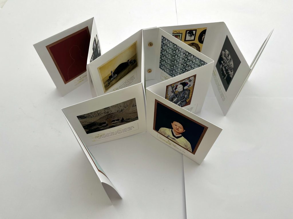
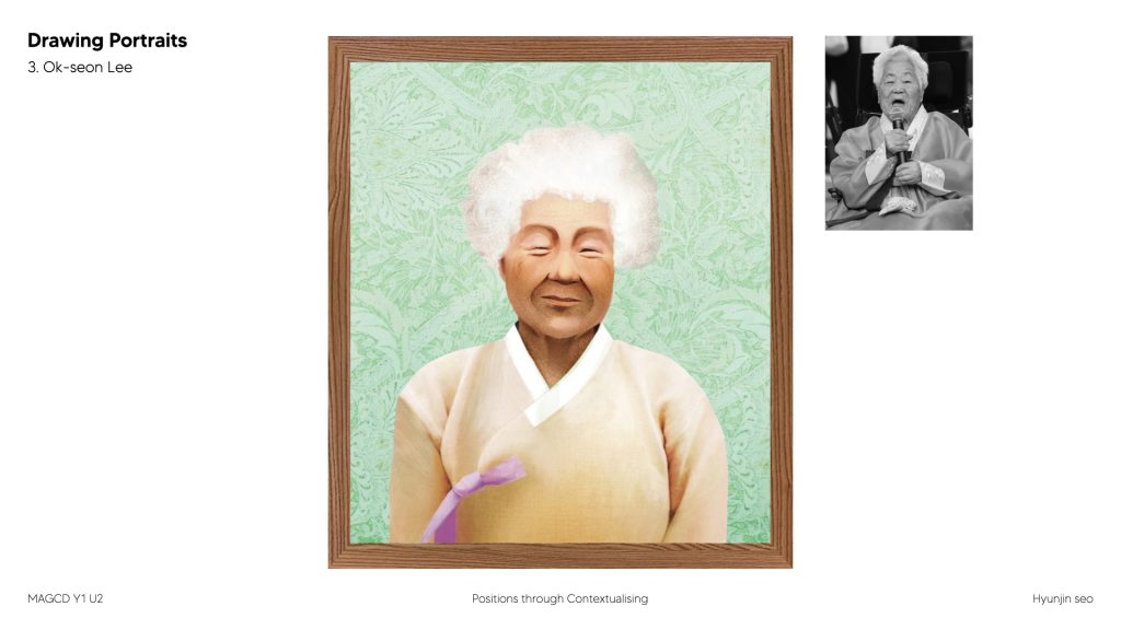
- The first is Lee Ok-seon, a comfort women survivor.
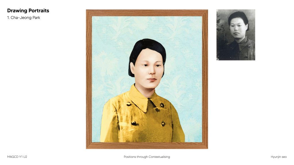
Her portrait smiles. Open the fold, and her lifelong Catholic faith was replaced, at the moment of her death, by a Buddhist ceremony decided by others. Open further, and you see the life she should have had. A quiet room. Photographs on the wall. Ordinary warmth she was never allowed to keep. - The second is Park Cha-jeong. Her portrait is steady and clear. Open the fold, and her gravestone does not carry her name as an activist. It reads: Wife of General Kim Won-bong. Open further, and you see the gravestone that should have existed. Her name, alone, carved clearly.
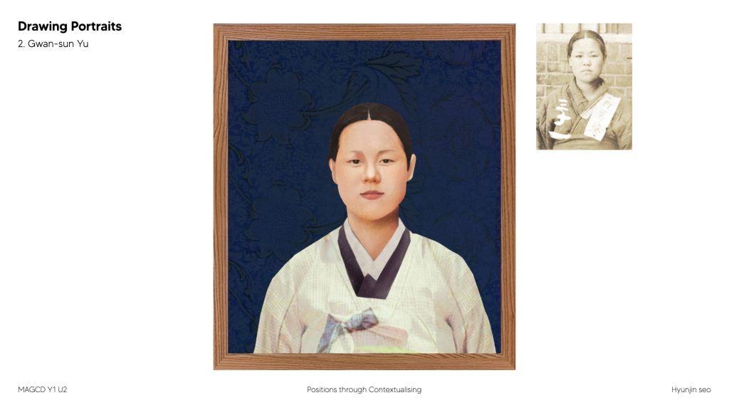
- The third is Yu Gwan-sun. The most perfectly flattened figure in Korean history. Open the fold, and she was virtually unknown before liberation. She was selected for the textbook because someone needed a Korean Joan of Arc. Her image was weaponised by the Park Chung-hee regime. On the day of her protest, there were 3,000 people at Aunae Marketplace. One name was recorded. The rest became a crowd. Open further, and you see those 3,000 faces. Unnamed. But there.
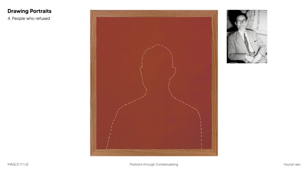
- The fourth panel is empty. A portrait frame with no one inside. Because the fourth story belongs to those who refused to be recognised — independence activists who rejected state medals because they would not let the Park Chung-hee regime, built on a foundation of collaboration, decide what their resistance was worth. Open the fold, and you find the administrative machinery of recognition. Open further, and the empty chair remains. The absence is not a mistake. It is the loudest thing in the room.
The most officially presented things erase the most.
A museum case pins a living thing behind glass and calls it preservation. A national curriculum selects one name from three thousand and calls it history. A sanctuary takes in survivors and calls it protection.
My work asks the audience to open the case. To unfold the surface. To find what was placed underneath, not by accident, but by choice.
The act of folding is the point at which graphic design stops being a tool of flattening, and becomes an act of resistance.
What is not recorded is not absent. Its absence is the record.
Leave a Reply